
INTERVIEW: Pattern Recognition: Bob Faust on “Wallwork (iam an Artist)” at the Intuit Museum of Art & “Wayfindings” at the Joint Public Safety Training Campus and Boys & Girls Club, Chicago

Installation view, Wayfindings at The Joint Public Safety Training Campus and Boys & Girls Club, Chicago. Image courtesy of the artist. Photo by James Prinz.

INTERVIEW
Bob Faust
Wallwork (iam an Artist)
Intuit Museum of Art
756 N Milwaukee Ave
Chicago, IL 60642
Wayfindings
The Joint Public Safety Training Campus and Boys & Girls Club, Chicago
4433 W Chicago Ave.
Chicago, IL 60651
As part of Intuit Art Museum’s recent reopening, Chicago-based artist and designer Bob Faust unveiled a striking new architectural intervention that reimagines the museum’s façade as both signal and symbol. Wrapping the building in bold, layered imagery drawn from works in Intuit’s permanent collection—including pieces by Henry Darger, Mr. Imagination, and Pauline Simon—the project draws passersby into playful yet reflective encounters. From afar, the vinyl wrap suggests modernist patterning, but closer inspection reveals figurative fragments and gestures that hint at the stories inside.
While different in scope from his recent Wayfindings public sculpture on the West Side, both projects reflect Faust’s commitment to building visual infrastructures of participation, layered with memory, identity, and place. The Intuit project stands as a quietly radical gesture—an outward-facing museum façade that listens back. Bridge Couture Editor Kristin Mariani sat down with Faust to discuss these projects and more in the interview below.
By Kristin Mariani
Kristin Mariani: I am so excited to talk about Wayfindings and your façade intervention at the Intuit Art Museum.
Bob Faust: Thank you, thank you.
Yes, yes. Would you like to start with the more recent Intuit Art Museum project, or Wayfindings? Do you have a preference?
Let's go to Wayfindings first, I think. It has a lot in it.
Great, It's such a beautiful project. Let's begin with community engagement. Wayfindings is a major public art initiative that deeply involves community interaction, located on the city’s new Joint Public Safety Training Campus and newest Boys & Girls Club at 4433 W. Chicago Avenue in the Austin neighborhood. Can you talk about how this participatory process influenced the design that you created?
Absolutely. It was a big project that took place kind of fast for something as large as it is. It included stakeholders even before anything was done—just the RFP process involved working with the stakeholders. It included: the police department, the fire department, the Boys and Girls Club, Alderman Mitts’ office, and a lot of neighborhood leaders including a few pastors, business leaders, block club leaders, art leaders, and DCASE of course. And then the kicker to it was that there were three architecture firms involved, as well as a landscape architect. So it was a lot of folks that had vested interest and wanted to know that all of their concerns, excitement, and opportunities were going to be acknowledged and worked into the final product.
We had lots of meetings, they were more like mini-town halls. Once we determined what this project was intended to do for all these groups, we then moved into the participatory part of the making. That phase was much more specific, involving police officers as first responders and young leaders from the new Boys and Girls Club. It was a lot to navigate. Kristin, I've been a designer for 30+ years and it's only recently, in the last six years, that I've edged my way more into the art world. I love love love these projects that come with stakeholder-shaping opportunities to build understanding across all of them. I use all my designer skills which are normal for any design project to happen. There might be a CEO and a marketing head and their client at the table, all with different kinds of ideas and intentions, which I am really comfortable navigating. So, this was really interesting for me, because the final outcome was art, but the process was really a design process at the front end.

Above: Installation view, Wayfindings at The Joint Public Safety Training Campus and Boys & Girls Club, Chicago. Image courtesy of the artist. Photo by James Prinz. Below slideshow: Installation view, Wayfindings at The Joint Public Safety Training Campus and Boys & Girls Club, Chicago. Image courtesy of the artist. Photo by James Prinz.


This speaks to how design can intervene in relationships that often bear tension, such as first responders and community members, especially in a neighborhood like Austin. Going on to my next question, I want to ask you how the project incorporates over 600 photos and text-based responses to the prompt: What makes you feel home, safe, proud, joyous, or free? Can you talk about that a little? That is such a beautiful set of questions to ask all the stakeholders in the project.
Yes, and those words came directly from all of those stakeholder meetings. As I run those meetings, I jot down things that I’m hearing that are critical bits, and those then find their way to the top of the pile and become a single question. To answer the question of how we got all those photos, I truly believe that the project—and this is with most things I do—the project is the process. The object at the end is just the manifestation of that process.
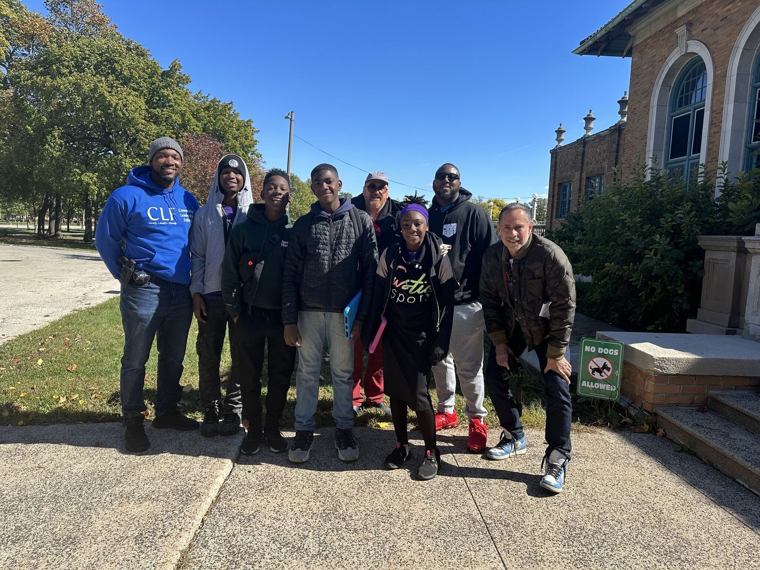
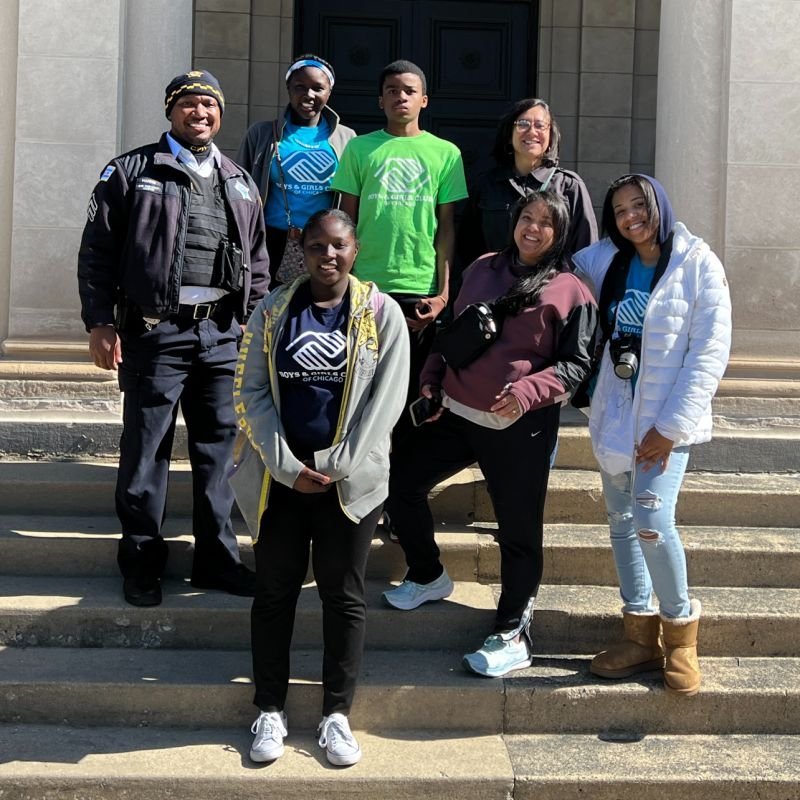
We had a full-on day where we had six young police officers, some just out of training, with a couple of more senior officers—captains and sergeants. Alongside them we had eight teenagers who were going to be leaders at the new Boys and Girls Club that was being built on the site. It hadn’t opened yet, but these young people had been identified as the ones who were going to shape that whole program.
We gathered at Alderman Mitts’ office one morning, with snacks for breakfast and lunch, and sat everyone down around the table as I explained what we were here to do. What I said was that a large part of this project is to show what we are all so proud of in this West Side neighborhood—the things that are memories, or the things that we look to that make us feel home, or safe, proud, or joyous, or free. These things are everywhere, when you walk from school to home, or from grandma's home to your house, or from the playground back home, or from the boys and girls club to your best friend's house. Sometimes we don't always see them, sometimes we just feel them, sometimes it's a color. Sometimes we see something hanging on someone's clothesline that reminds us of something at home. It’s maybe just a pillow. It’s the feeling these things evoke, and we might see that feeling as we walk through the neighborhood.
So we gave everybody cameras, but before that, we did a centering exercise where we closed or softened our eyes and talked about this prompt. We were trying to get people out of literalness—just because my dog makes me feel home or safe or joyous doesn’t mean we have to photograph that exact dog. We just had to find the feeling of that dog. It’s the feeling of it that matters. So we abstracted everything, and then did a prompt to get those ideas on paper, out into the ether. After that, we split into small groups. Each group had a police officer, about five students, and a chaperone. Then we went out in four different directions through Austin, and everybody took pictures. No pictures were off-limits and anything that made any kind of trigger happen were legit to take.

Installation view, Wayfindings at The Joint Public Safety Training Campus and Boys & Girls Club, Chicago. Image courtesy of the artist. Photo by James Prinz.
We collected all of those images afterward, and literally made a presentation to all those groups to show everybody what was made—literally took all 600 images—and made a book that now lives in the Austin Chicago Avenue Library. As well, each of the participants had one placed in their hand. Also, there’s a time capsule inside one of the sculptures so that every image is part of this project. We then helped participants understand, we might have had 50 images of the puppy clouds because the sky was so amazing that day, or we may have had 12 images of this person who has goats in their backyard. Everyone's ideas showed up in the source image that was then selected to make the patterns from, and those patterns are what you see on the actual sculpture.
So in many ways, you were finding the things that were held in common amongst the participants, and able to find a representation that spoke to the diversity of responses. Beautiful!
Exactly. Thank you. It was really important to me that I not be the author of what represented Austin. But I could be the facilitator that helps find those things, and I could be the artist that makes a final product from those things. So, the authors are everybody. Everyone’s name is on a giant acknowledgment sign at the site. It’s over eight feet long.
That connection to the fabric of the neighborhood is compelling. Were there moments in the installation process where you felt the community's presence in the work?
Absolutely, especially during the unveiling. People came out from all around the neighborhood. Families were pointing out the images they contributed, sharing stories. It was alive in a way I don’t often see in public art. It felt personal, not just for me, but for everyone who took part. The layers of storytelling really made it feel like a living document of the community.
It sounds like what you created was a kind of infrastructure for this participation to occur emotionally, socially and architecturally.
Absolutely. It was super important that the process of contributing to this artwork did not feel at all like we were asking someone to give that to us. It was really important that the community participants were part of it and shaped it. We were really, really careful about the words we used for this invitation, and we used that word very carefully. It was an invitation to be a part of this project. Everyone was fully informed as to what we were going to do, how we were going to do it, and then how those images or words were going to be used in the end.
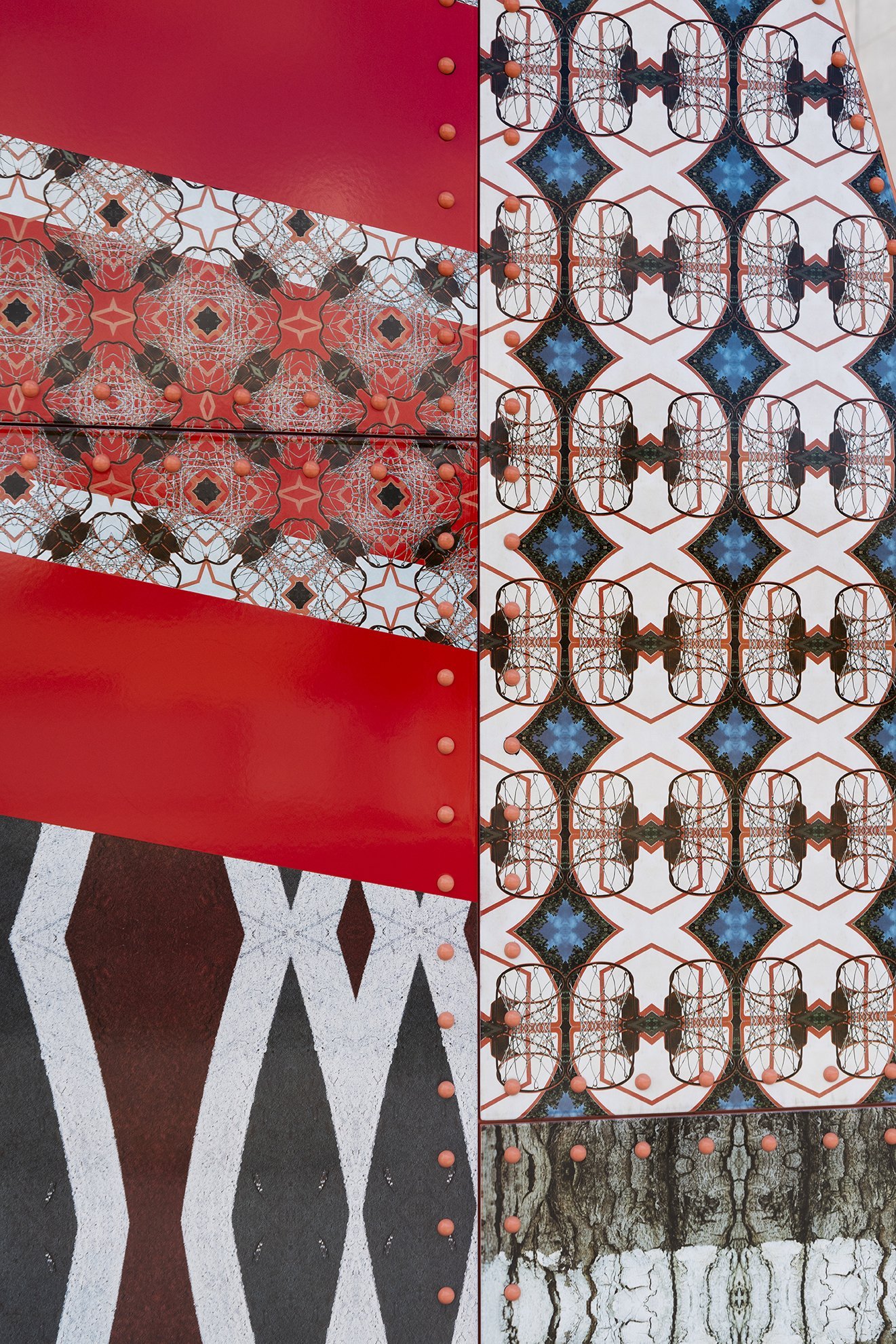
I'd like to ask you a little bit about the material choices. Your use of metal, paint, and digitally imaged enamel panels are placed prominently in Wayfindings. What drove your selection of these materials and how do they contribute to the project’s thematic goals?
It's a two-pronged answer, there's a practical one which is it needs to be super durable and very low maintenance. But more importantly was the aesthetic choices as a new artwork cited in Chicago, specifically on the west side. I was very inspired by the hulking architecture of Chicago, specifically bridges, and how mechanical fasteners, like rivets or bolts, play an aesthetic role, not only through pattern but also the showing of strength instead of the hiding of strength. It was an unabashedly Chicago kind of expression. At the front of the project I was researching Chicago Public art, the ones we all know and love like Picasso and Calder. I was trying to figure out, “Okay, if they were making this work now, how might those same materials be interpreted and used?” I was trying to find a way of materially tapping into the history of public art that would not lose the lightness that artists were able to achieve back then. Now, public art has so many more requirements to meet.
Installation view, Wayfindings at The Joint Public Safety Training Campus and Boys & Girls Club, Chicago; the artist with students of the Boys & Girls Club. Image courtesy of the artist. Photo by James Prinz.
In another piece, 3rdi (2010-11), Bilal surgically attached a camera to the back of his head and carried it for over a year. The camera captured snapshots of the artist's surroundings, and what's on view at the museum—back-projected onto a tilted screen as though it were going to fall onto the seated viewer—is a series of still images, synchronized to the minute to Chicago's local time. A lot of images are murky or blurry, possibly due to obstruction or movement. But occasionally, you get a nice crisp view of outside the window, knowing that the artist was looking the other way.
In looking at pictures of the project, Wayfindings is so beautifully light, so colorful, so welcoming, especially against the green background. How do you feel these images, materials and colors will hold up in the thick of Chicago winters?
So that's the other thing about the materials: the enameled metal panels are critical because you don't see much sculpture where there's a lot of color. You might see one color, or you might see two or three colors, but you rarely see a pattern that's exuberant and constantly changing. Like the old signs in Europe that have been up on buildings forever, and they're beautiful. You can feel the texture of how that glass melted and became a texture itself. Well, this is like digitally printing through clay based colors going into a kiln, melting and fusing so that you then have this surface that is impervious to anything. You could hose it off, or blast it off if it got graffitied, but it's still just as delicate and lovely as dinnerware! It's super special while being super adorable at the same time, and no doubt from the get-go, I was really paying attention to the design of the Boys and Girls club, and the design of the joint public training campus because those were architecturally significant in their own right. I also got to work with the landscape designer to design the plaza that it sits in. So, literally the way the grass and pathways are laid out are part of the sculpture itself. It's not just an object in a plaza- the plaza is the object.
Image left: Officer from the Joint Public Safety Training Campus with students of the Boys & Girls Club. Photo by James Prinz.
You're thinking about how people will move through the sculptures and engage with them, not just look at them.
Thank you. I'm glad you see that. It's closest to the Boys and Girls Club where if you’re kid-sized, you have to climb under it, whereas if you’re adult-sized, you almost can’t. It’s super fun.
I'm going to jump to the next question about legacy and impact. What are your hopes for the long-term impact of Wayfindings on the community and how do you see it influencing future art projects in Chicago?
From my perspective of the legacy, it's the time spent with the young kids from the Boys and Girls Club specifically. I think for me, they become part of the legacy. For them to be part of a project that they were presented to, and that they were brought along with, and became leaders of, can only sit in their body a certain way. It has to come out later when they're talking to their kids or their grandkids. And now they get to take them back to this object, that has their name on it, and the book in their living room that they get to see, “Oh, Chicago included me in a permanent Public artwork that's on the same page as Picasso downtown,” I think that whole thing just gives⸺it's seeing people, at the end of the day, and they see their work.
I was selected not because I'm the greatest artist in the world; I was selected because they thought this to be a complicated project, and a complicated site that requires realism and understanding. That was a skill set that I was able to bring to the project.

Installation view, Wallwork (iam an Artist) at The Intuit Art Museum, Chicago. Image courtesy of the artist. Photo by James Prinz.
Well, that's incredibly humble of you, and a beautiful sentiment. Let’s go four miles east to the Intuit Art Museum, and talk about the facade intervention that you've made. The official reopening is May 23rd, right?
Yes. It's a very different project, very different.
Go ahead, speak to that if you would.
Yes, so this one is very close to me. Wayfindings is a permanent public artwork. Intuit is a long-term temporary architectural intervention. So very different projects, but they have some goals that are similar. Intuit has been there for a long time. They also shuttered for a long time during this remodel, so this project had a job to do too. It had to signal to the neighborhood and to Chicagoans that Intuit was back and open and better than ever. It also had to signal to the new neighbors, who had never been to Intuit, that there's a museum that's right in their neighborhood. We wanted Intuit to be a kind of icon that got attention in its own right, to bring attention to the fact that Intuit is a museum and not just an art center. How did we do that? We decided that what we were going to do is tickle out to the exterior of the building the treasures that are inside, specifically the artworks that are already by Chicago artists in the Intuit collection, and then chose a good dozen of those that were representative of the kinds of work you might see inside. Those became the source photos that would become the patterns that would then go on the outside of the building. From far away, you won’t know the first patterns are made from artworks, it almost looks like Moroccan or modernist patterning, or what have you. But as you come up close, and you're on the sidewalk, every day on your way to work, you say, “Oh, I see a face in there, or a hand or an umbrella. Oh, let me look,” and then you start to see that there's something to discover inside, that everything that's on the first level, on the first floor, it all cues you in. That's when you start to see the whole artwork and the names associated with it. There's three different reads that go from 100 feet away, from across the street and then one from 2 feet away where you are actually involved.
Could you name some of the artists whose work you pulled from?
Yes. It's actually on the front façade. But it's Henry Darger, Mr. Imagination’s and Pauline Simon on there.
Will visitors be able to see some of the works that are on the facade at the opening?
Yes.
I think it's almost like a play, it's like Where’s Waldo? that makes the barrier of entry to a museum zero. It already comes with a low power of entry compared with other museums. But when you choose the word museum, they also know that they're entering that space where people have some anxiety. So I really like that the play comes out inside.


Above slideshow: installation view, Wallwork (iam an Artist) at The Intuit Art Museum, Chicago. Image courtesy of the artist. Photo by James Prinz.
You describe this as a long-term temporary installation, so there’s this durability built into it, but also this idea that it’s going away. Could you talk about your choice of materials and how it was installed?
It's a material that I've been using a lot, maybe for the last seven years. It’s essentially a building wrap— the same material people use to wrap cars, buses or billboards. This one has microscopic holes throughout the surface, you can't see them, but when you apply heat, the material will suck into all the crevices and into the grout lines and you can really feel the material that it mounts upon. So there's a real sense, it feels more like a paint, but you get the benefit of being able to use photographic content. It's really cool how this one is applied to the specific building, as we had some limestone window lintels that were historic and that could not be touched based on the historic preservation rules. Then we had two different façades and lots of different articulations of the building, and it just felt very Intuit to really pay attention to the materials behind the vinyl wrap. It allows some of the facade to come through, since we're already avoiding the limestone lintels, let's also pay attention to the different kinds of brick and the patchwork that is already going into making this multi-building façade. And it just became more human, more intuitive, more of the way a self-taught artist would've worked. It's a feeling of, “I'm gonna do this that way here, because this brick is kind of funny and I like it and let's show it off.” I see this particular angle or line, let's play it up instead of playing it off.
So, a kind of melding. The material was responding to the material it was going into.
I think you're very used to seeing this kind of material obliterate a façade, and it becomes very commercial, like “Buy this soap.” But the minute we're looking at the architecture and it's particular articulation, and then making choices about what design goes where and how it reacts to the scale and brick pattern that's already there, or the rhythm of the windows that's already there, or the height of a human being and their access to the artwork, then it becomes so integrated that I think you drive past it and it already feels like it's been there for a long time. I'm like, “Why is it getting all my attention but it's already part of the local fabric?” It's very interesting.
In one of the documentation photos, I saw that the wrap was wrapping around a corner. I think you wrapped around a lot of corners on that façade, right?
There were lots of little funny things. I think the installers didn't love it, but I loved it.
Thank you so much for sharing all of this Bob. It’s been wonderful to hear the story behind both projects.
Thank you, it's been an absolute pleasure.
Kristin Mariani is an artist, Couture Editor of Bridge, and Founder of RedShift Couture.
Like what you’re reading? Consider donating a few dollars to our writer’s fund and help us keep publishing every Monday.